Title: Bloom
Artist: Nicole Ponsler.
Location: Palo Alto, Santa Clara County, California.
Year: 2023
Section one: Visual description.
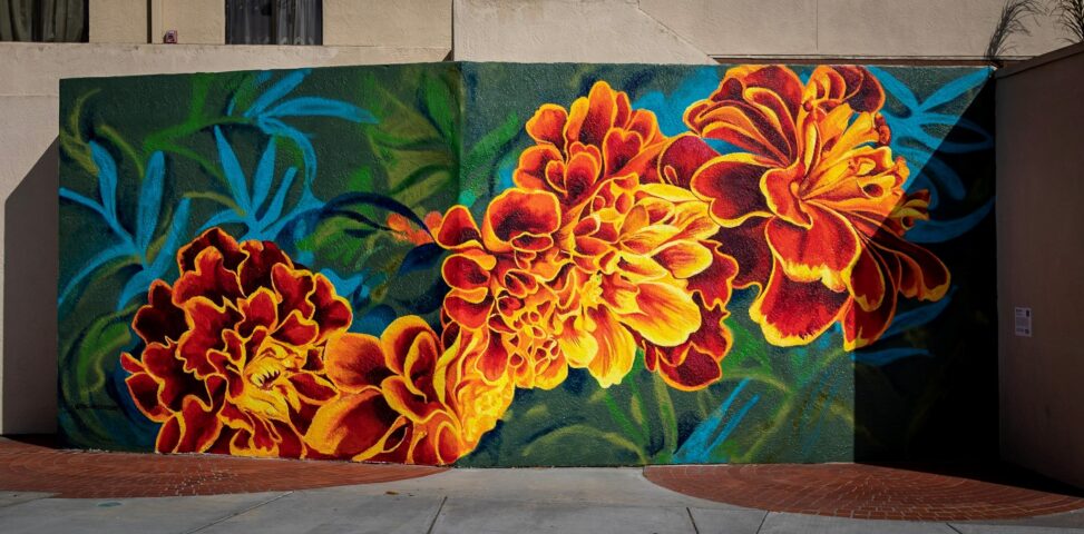
The artwork has a series of flowers connected together across its centre, making it the focal point of the painting. There are no straight lines in the painting as the artist uses curved and circular shapes to make up the flowers and leaves. The foreground of the painting– the flowers– has bright colors of red, red-orange, orange, and orange-yellow making it the focal point. The background–leaves and forestry– has a mix of dull darker and lighter shades of blue and green.
The foreground of the painting has an implied texture. The surface is flat, but the manner in which it was painted makes it so that you can tell the texture of the flowers in the painting. The background, however, is flat and has no implied texture, neither is it three dimensional. It is neither crowded nor open, but since the foreground runs across the painting, it gives it a more central and minimalist look.
The artist painted it in two connecting walls making it a fairly large art piece. It is visually balanced as every color used creates unity. They work well together and don’t try to bring attention to one part. Although there is a balance, the painting is far from symmetrical. Each flower shape is different from the other, each curve is different, even down to the petals and leaves in the background. The visible brushstrokes show the curved patterns she used and shows its irregularity and lack of mirroring and repetition. That gives it its organic nature.
Section two: Interpretation and Meaning
The shape and flow of the flowers, though irregular and different, feel the same. One could look at it as a symbol of growth from young age to adulthood, or from a period of one’s life to another period of life because of how each flower grows into the other, creating a sense of nostalgia. Or one could look at it from the aspect of the beauty of life despite its ups and downs. From where the flower begins, we can see how the shades are much darker and as they progress, they get much lighter before they get slightly darker. It passes the message that some parts of life will be much brighter than others and that despite those downs life can still be beautiful.
Their bright nature of the painting radiates a sense of warmth because of how close in colour it is to the summer sun. Flowers represent the end of winter and the incoming of spring. It’s inviting, positive, calm, and reassuring that there is always sun after rain and calm after a storm.
A lot of people can view it differently because of the nature of people and the painting itself. Some viewers can see it as a symbol of motion because of its continuous blooming and progression. Some can view the darker and lighter shades as different emotions. Happiness and sadness. The more sharp and bright colors may not be felt as warmth or calm but as fiery passion, anger, resilience. The much duller colors at the background may be seen as melancholy, depression, and negativity instead of nature and sense of renewal. The emotional standpoint makes the case that humans are of many emotions and the collection of all that in one painting humanizes it to a degree.
Some would interpret the painting as an example of wabi sabi– a Japanese philosophy that appreciates the beauty in imperfections. The painting’s simplicity and asymmetry gives it a unique beauty. It is not conforming to ideas of perfection, yet it is retaining its own individuality and beauty in its imperfections. It’s got a little wabi sabi.
Section three: Space, Power, and Access
Although the painting was commissioned by the Palo Alto public art program, it is fortunately open to the public for free viewing on their website and for locals and tourists in the area to view and interpret in passing as it is a public and physical mural.
saaniya mehta
Your description of Bloom helped me visualize the artwork clearly, especially the way you explained the use of color and curved lines. I thought your focus on the bright foreground flowers against the darker background was a strong descriptive moment because it shows how the artist creates emphasis through composition.
Your interpretation is convincing because you connect the changing shades in the flowers to life’s transitions and emotional highs and lows. This idea is supported by the visual evidence you describe, and it adds depth to the mural’s meaning.
You might strengthen your analysis by expanding more on how the mural’s public location and large scale affect the viewer’s experience. I was curious about how encountering the work in person might change its impact compared to viewing it online.
How might this artwork be interpreted differently by different audiences or cultural perspectives, especially since flowers and color can symbolize many different emotions and meanings?