Artists: Claes Oldenburg and Coosje van Bruggen
Location: Apart of the Doris and Donald fisher collection at the San Francisco museum of modern art.
Date: 1991
Section 1 Visual description:
Visual elements
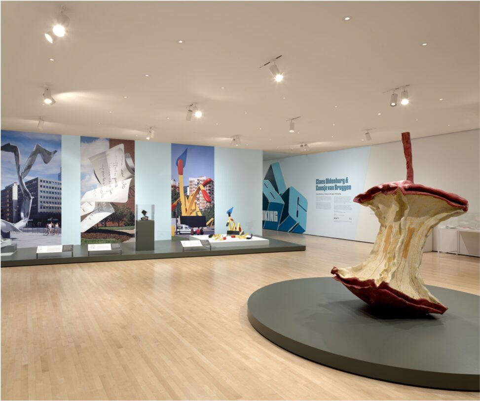
The photograph shows an angled photo of the large apple core, the angle shows how large the core is. It is placed on a platform making it seem like a centerpiece. You can see other art in the background signifying that this art piece is inside a museum.
The colors used are a dark red along the top and the bottom signifying this was a red apple. The core is a more off-white yellowish tinge color. The skin of where the seeds would be is a darker yellow. The stem seems to be a more maroon Ish brown.
Materials used,
The apple is made of latex paint, polyurethane, and steel.
The texture seems to be a rough chewed affect, it looks ridged and hard, the untouched top and bottom have a smoother and softer look.
The focal point is the hollowed centre, eyes will immediately be drawn to the centre instead of the top and bottom. The contrast between the dark red on the top and bottom vs the light centre makes it the main focus.
Section 2 interpretation & meaning:
This art piece seems to be about consumption, waste, and what is left behind after something has been used. Instead of showing a full apple, the artist chose to show only the apple core, which is usually thrown away. This makes the viewer focus on what remains rather than what was once whole. Apples are often connected to food, health, or nutrition, but the hollow center having a chewed looking texture make it feel used and empty. The rough, ridged inside suggests that the apple has been eaten fully, which could represent the taking of something until there is nothing left.
The placement of the artwork plays a big role in how it is understood. The apple core is placed on a raised platform, making it look important, almost like a centerpiece. This is interesting because apple cores are usually seen as garbage, not something worth displaying. But by putting it in a museum and giving it its own space, the artist makes viewers stop and look at something most would normally ignore. The large size of the apple core, shown by the angled photo, also makes it feel more powerful and noticeable. This makes the audience think differently about an everyday object and what it might represent. Even if it’s just an apple.
Different people may interpret this artwork in different ways. Some viewers might see it as a message about waste and overconsumption. Others might see the hollow center as a symbol of emptiness or loss, showing what is left after something has been taken or used up. Some people might even find the artwork funny or ironic because it is a huge version of something so small and disposable. Overall, the artwork makes viewers think about value, waste, and how ordinary objects can have deeper meaning when placed in a different context.
Section 3 Space, Power, and access.
As this piece is inside a museum it is pretty easily accessible. Although not everyone will see it as not everyone goes inside museums. The people who will see it are the ones who go to museums and go to see art. Vs if it was outside in a public place more people would see it, although a majority of the people who would see it wouldn’t appreciate it as much as the people who go to museums. Along with if it was outside, it could be viewed different.
Because it is placed in a museum the people who view it would view it as more than just a large apple core. They will view it from different perspectives and experiences. The art being so large makes the encounter planned as it would be very hard to miss. It’s very large and something many have seen (an apple core) because of this it will get people thinking. Perhaps even stop people to just observe and put their own opinions and thoughts towards it.
Chun Yip Wong
Your description of Claes Oldenburg and Coosje van Bruggen’s Geometric Apple Core is carefulness. I could easily visualize the oversized apple core with its dark red top and bottom, off-white yellowish center, and ridged, chewed texture, thanks to your attention to color contrasts, materials like latex paint and steel.
Your explanation makes it easier for me to understand and empathize, especially when you connect visual elements to meaning, for example, the hollowed, rough center symbolizing consumption and emptiness, and the elevation on a platform transforming everyday waste into something monumental and worthy of contemplation. These observations show a strong understanding of how the artwork critiques value, overconsumption, and the irony of displaying the disposable as art.
You might strengthen your analysis by discussing how the museum’s controlled environment influences viewer engagement more deeply. While you note the planned encounters and audience demographics, it could be helpful to explore how lighting, surrounding artworks, or the indoor sterility might amplify the piece’s irony compared to a more chaotic outdoor space, this will further enrich your argument.
One question I have for the author would be, how might the interpretation of this artwork change if it were installed in an outdoor public park rather than a museum? Does placing it outdoors help more people understand and feel the urgency regarding waste?